Selected work
Proof, not theater.
The rails themselves
The U.S. switch to chip (EMV)
When the country moved to chip cards, I ran usability sessions in 12 major U.S. cities and turned the findings into recommendations for major banks and terminal manufacturers — cutting friction during a transition that's now mandatory nationwide.
Mastercard × Apple Pay
First-hand work on the Mastercard–Apple Pay partnership — meeting Apple's exacting standards for seamless, trustworthy onboarding as mobile wallets went mainstream.
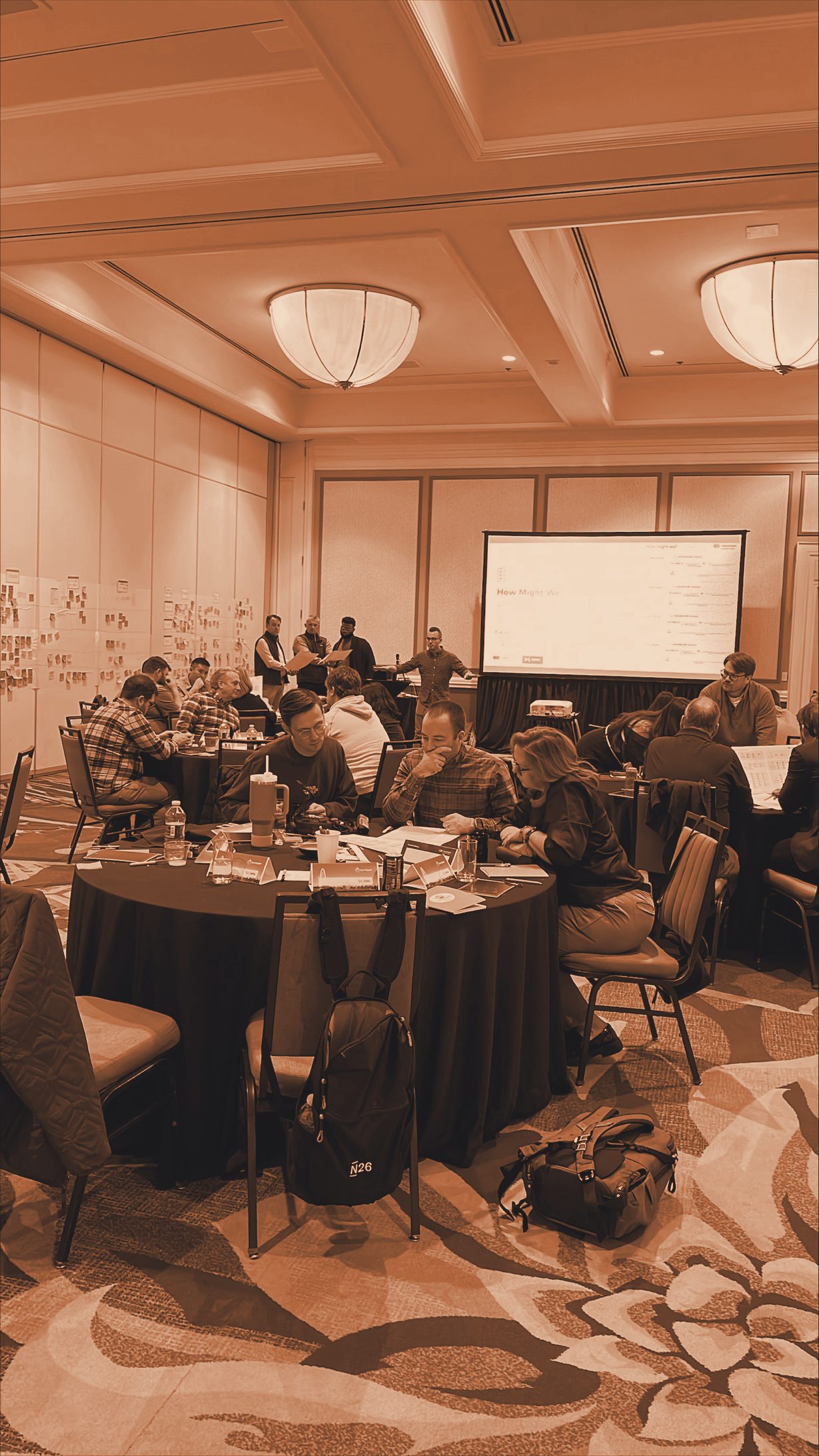
Modernizing how millions receive federal benefits
A U.S. Treasury and Mastercard partnership to move Social Security recipients — many unbanked or underbanked — off mailed checks and clunky call-in systems and onto reloadable prepaid cards with a digital experience they could actually trust.
Trust beat innovation. Calling in to check a balance wasn't friction to design away — it was a daily anxiety-relief ritual to honor.
A digital front door for medical tourism
Finding a reputable overseas provider, booking the travel, paying safely, and managing aftercare were all separate, broken steps — and the real gap was payments: wire your savings abroad and hope. I led the 40-week innovation engagement that turned that into one trusted, end-to-end platform.
The product was never the app. It was recourse — turning "send the money and pray" into something backed by real rails.
Four years inside the network's front door
Mastercard Connect is the primary touchpoint between the network and every customer it has — issuers, acquirers, partners. I spent roughly four years embedded in it, running the research that shaped how customers actually experience the platform.
When everyone's frustrated but no one can say why, it's usually a question nobody thought to ask — like "wait, why are there two of these?"
The deepest one — and the one I can't show you
Mastercard Connect is the network's self-service portal where issuers configure how their card programs behave. Years before that configuration became today's slick self-service product, it lived in a legacy two-axis spreadsheet — dense with the logic that codes card behavior — and I designed its replacement — the Customer Parameter Management app — a single-axis web tool that lost none of that functionality, worked for everyone who might touch it, and did it with the handful of people who understood the system almost entirely unavailable. Two months on paper. It took me a year.
- Self-taught on design — from Connect's own design system and style guides
- Taught myself the domain: sat in on sales trainings to learn how card parameters actually work
- Ran 6–7 full usability studies to iterate toward something the few real experts would trust
- Early, foundational work in the shift the whole industry has since made — manual, range-bound configuration → on-network, self-service control
- The deepest financial-services knowledge I've ever built
One portal for novices and power-users
A white-label payments provider needed a self-service portal that worked for both first-timers and experts at the software companies (ISVs) they serve — across two genuinely complex spaces, payments and development. I led the 7-week innovation engagement; the client started building in production before we'd even wrapped.
SMB loan decisions, fast instead of frustrating
A regional bank's commercial-loan process meant paper, disconnected systems, and in-person trips. In a 4-week design-thinking sprint I took a cross-functional room from problem-framing to a validated, high-fidelity prototype and executive pitch.
Killing the waste in employee tech support
As UX SME for a 30,000-person workforce, I ran the contextual research and stood up the task force that unified 7+ separate help desks and rebuilt how support actually worked — severity-based routing, self-service tools, walk-up support.

Dozens of engagements, one discipline
The deep dives above are a sample. Across Mastercard Digital Labs and direct client work, I've run dozens of pre- and post-launch engagements — banks, card issuers, payments providers, and software companies. Two dozen-plus were full design-thinking innovation engagements — rare volume in a field where a hundred marks world-class and most practitioners never run more than a handful. A selection, described rather than named:
Top-5 US bank · subscription banking
A debt-reduction account that threw the whole toolkit at the problem at once: spot & cancel unused subscriptions, line bills up against paydays, split bills with a partner or roommates, free banker office-hours, an open-banking overview, and financial-inclusion education — penalty fees traded for one very low subscription fee.
Top-5 US bank, wealth division
Built engagement-tiered personas — never-logged-in, basic, and active — each with its own barrier to going deeper, then mapped the participant journey from onboarding through annual review into retirement. Delivered a personalization strategy and a prioritized set of feature concepts for a smarter benefits dashboard: savings-and-retirement modeling, educational nudges, and a friction-free enrollment flow — brought to life in a working product demo.
Global card issuer
Ran ten current-state interviews and a one-day strategy workshop to map how credit offers were actually being built across channels. Surfaced the real blockers — fragmented channel-by-channel solicitations, no central offer repository, almost no test-and-learn — and delivered a coherent strategy: a dedicated cross-channel offer team, a real experimentation capability, and a single arbitration engine to replace the silos.
Global card issuer · repeat client
Segmented the cardholder base from real travel-spend data — finding that 8% of cardholders drove 63% of travel spend — and profiled the high-value traveler types worth winning. An ideation sprint generated 28 concepts, narrowed to a prioritized set of growth experiments — transaction-triggered offers, unique-destination unlocks, a personalized trip-recommendation builder — each written as a testable hypothesis with its own KPIs and target segment.
Large US retail bank
The bank's alert inventory was a manual sprawl — 1,000+ entries across 13 spreadsheet tabs, with no confidence it even captured every touchpoint. Through customer research, an ideation workshop, and quantitative analysis, the core complaint surfaced: irrelevant, un-personalized alerts that quietly eroded trust. Delivered customer personas, a mapped journey, and an MVP for one unified, relevant messaging experience across products.
Association & nonprofit software company
Across a two-day strategy-and-design sprint, built the case for moving member and association payments off cash and checks and onto cards. Profiled both sides of the platform — the association director chasing predictable cash flow and the member who just wants to pay in a tap — and pinpointed the real barrier: gaps in awareness, not willingness. Delivered personas, a communication-and-education plan, and stakeholder-ready experiments to drive digital-payment adoption.
Major prepaid & payments provider
Centered the work on the underbanked customer living paycheck to paycheck — mapping the journey from onboarding and KYC through the moments that make or break direct-deposit adoption. A two-day sprint produced 20 problem statements and 32 actionable ideas, converging on a high-fidelity prototype for a prepaid experience that earns frequent use: overdraft cushioning, credit-building, fee transparency, and instant in-store issuance.
most under NDA
For clients who couldn't afford a research department, my team was the research department.
Over 14 years I've directed UX research on 100+ products across wildly different industries — the same discipline, re-pointed at whatever the problem in the room actually is.
The right method gets pulled for the problem in the room — 70+ of them, from a library of 175+ activities. How I work →